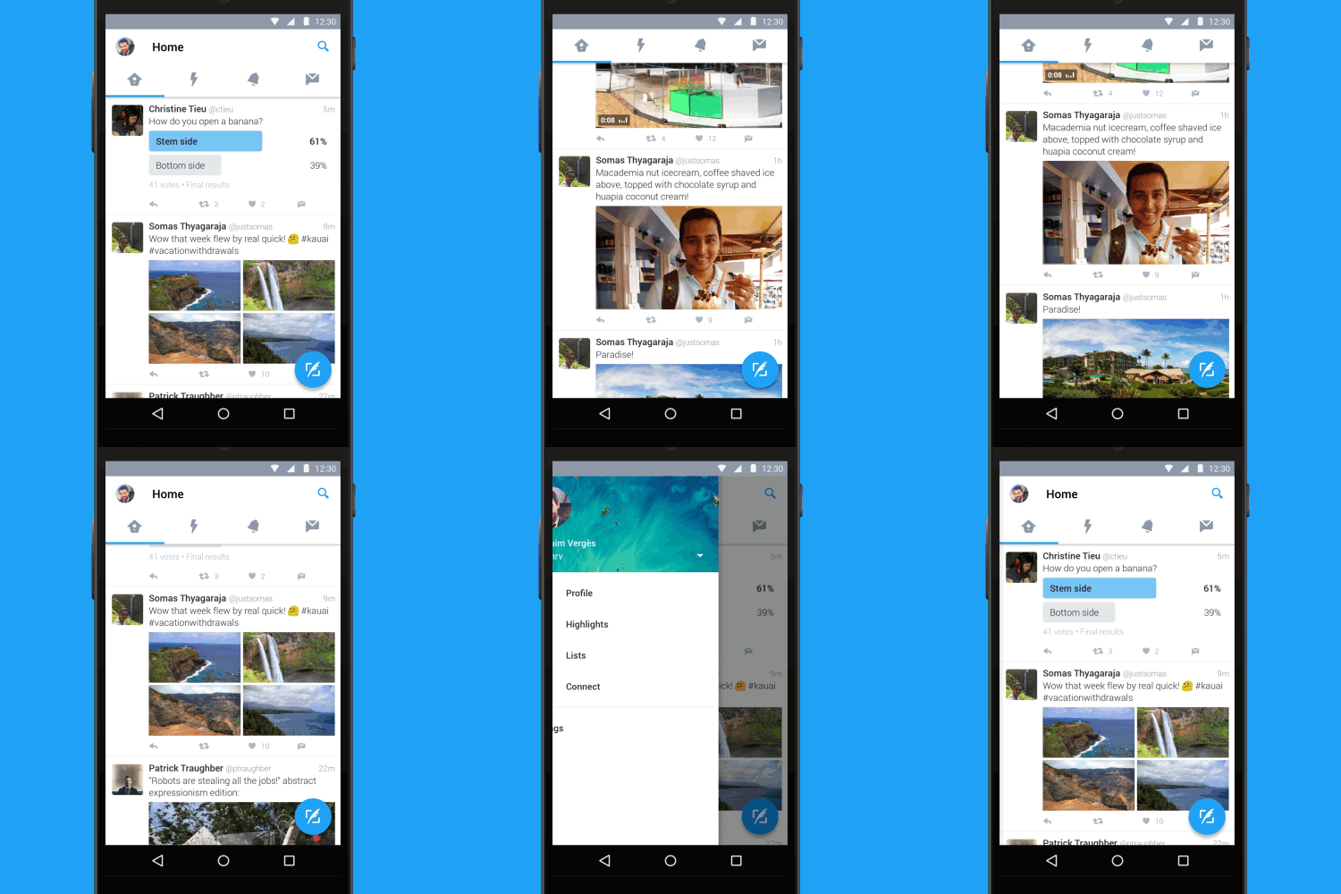
Twitter is out with a new look for its Android app — one that follows Google’s Material Design guidelines for Android apps.
What’s Material Design? It’s a design language that Google unveiled when it launched Android 5.0 Lollipop. Google has pushed the design to almost all of its apps, and many other developers have followed suit with their own apps as well.

Some of the unique changes being implemented in Twitter for Android includes:
- Tab bar at the top of the screen with swipe functionality so you can quickly move between your Home timeline, Notifications, Direct Messages, and more.
- Navigation menu that slides out from the side for access to your profile, Highlights, lists, the Connect tab, and settings.
- New floating action button so you can always easily send a Tweet.
The design still maintains the white-and-blue theme that Twitter is recognizable for, but now you can easily slide between your notifications, timeline, Direct Messages, and more. The floating action button sits on the bottom right of the app, allowing people to compose a tweet instantly.
Sliding out the navigation drawer brings you quick access to your profile, Highlights, Lists, the Connect tab, and of course, your settings.
You can access this update by heading to the Google Play listing for Twitter and hitting the update button if you've not already done so.


0 comments:
Post a Comment